11 steps for developing a unique photo editing style
by ling and jace
home / back to photography
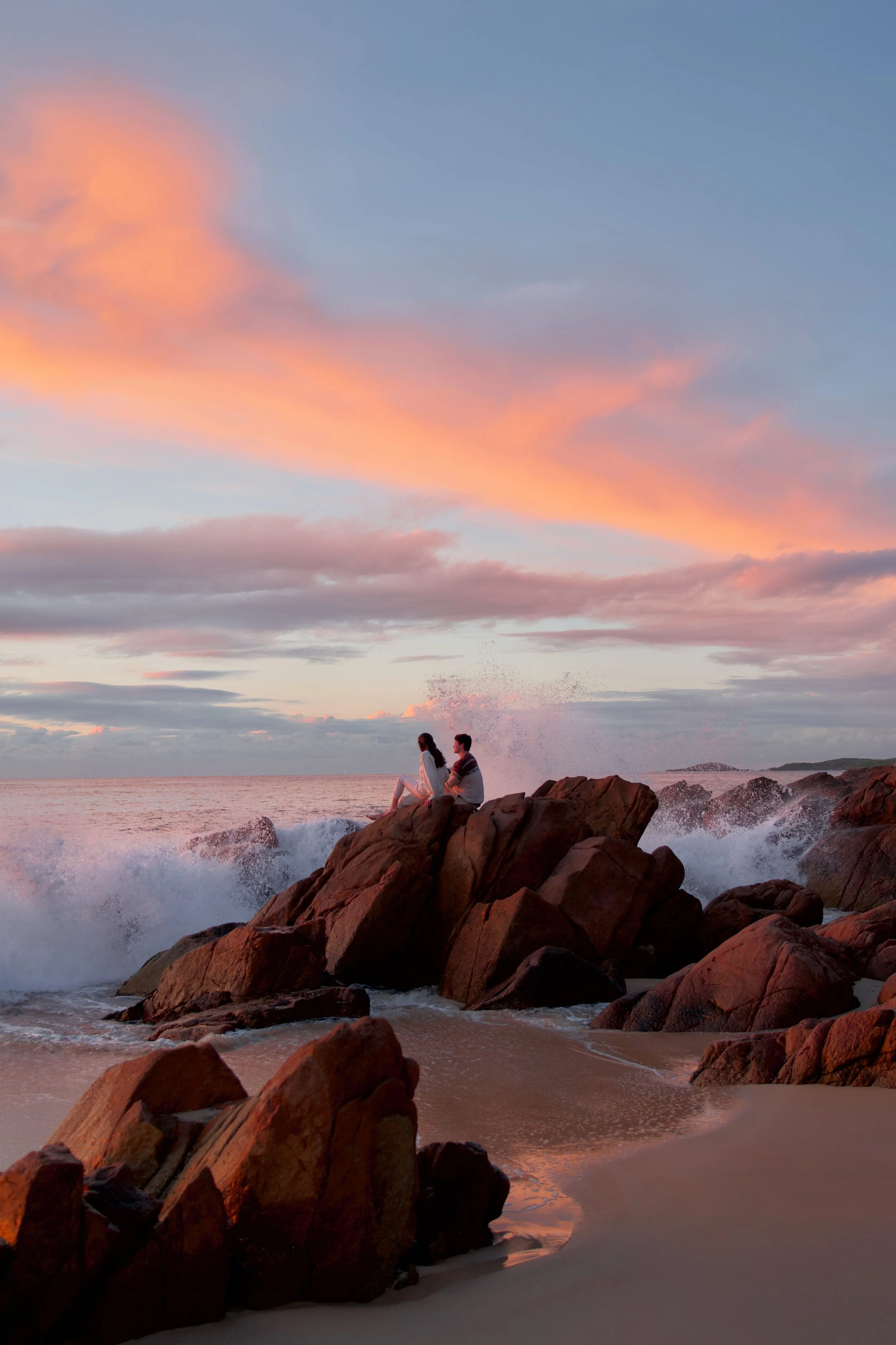
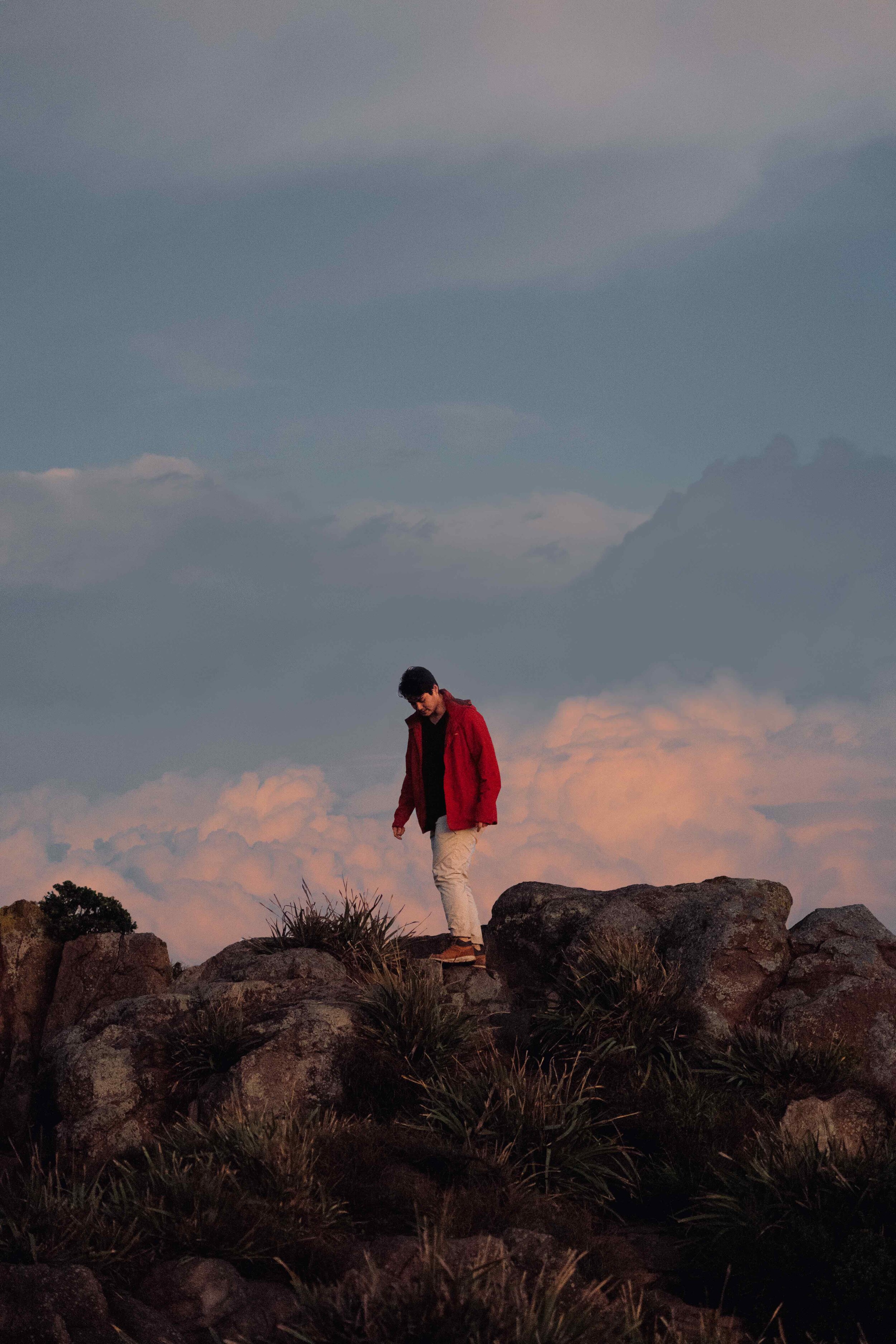
Sunrise at Zenith Beach, Australia | Sony A7III with Sony 24-105/f4 lens
ISO 100, 35mm, f4, 1/60 s
At some stage our photo editing style became a bit more recognisable, and people started to describe our images in similar ways. All of the separate elements that we liked about editing photos were becoming more cohesive and distinctly ours.
We don’t know if it’s really possible to just “find” an editing style, as it’s more likely to be something that is figured out over time. But if you’re feeling stuck, there are definitely steps that can be taken to start the process. Here are 11 tips for developing a unique photo editing style, with everything that we think about when editing photos from start to finish—from the lighting and colour palette to the mood and feel of the final image.
We’ve included examples of a range of different editing styles and the specific settings and adjustments that can be used to achieve them.
1. Start with free editing apps
For editing on a phone, we’d recommend using free apps like Lightroom (mobile version), Photos (the main editor on Apple products) and ColorStory. On Mac laptops, we’d recommend starting out with Photos, which is free. All of these have general settings for lighting and individual colour grading, as well as features that are unique to each of them like luminance, brilliance, and filters in the case of ColorStory. We started by getting familiar with a few of the settings, and seeing how they affect the types of photography we were working with.
We now use a mix of Photoshop, Photos and Lightroom, depending on what we’re editing.
2. Collect examples of editing styles that you like
Over time, we’ve both come to recognise the types of photography we’re drawn to and the editing style that works best for our own photos. They’re not always the same, and the things that we like always just come down to personal preference. I usually prefer lighter, very hazy, pastel images, while Jace is more into darker, contrasted and more dramatic editing styles.
It helps to be really clear about your own preferences, and we’d suggest starting by looking at the editing styles of other photographers when thinking about them. We started saving a collection of images that we liked (on Instagram or Pinterest), and as we selected them, talked about what exactly it was that we liked about them.
Once there are a few images saved, see if there are any common themes. When we look at photos, we tend to notice distinct moods, which might be whether the images are:
lighter and brighter
more dramatic
crisp
hazy
saturated or desaturated
warm or cool
If there are specific things that you like about any of the shots that you’re saving, you can start making similar adjustments within your own photo editing process. The styles that you’re selecting might not always suit the types of photos that you’re taking, but there are ways to replicate certain aspects of those images—and if you start there, you can get more of a feel for how it all translates to your photography.

3. Start by making adjustments to the lighting
Lighting is one of the most important parts of photography and immediately affects the style and mood of an image.
Many different parts of both the photo taking and editing process can change the lighting of an image. When shooting, things like the time of day, weather conditions and camera settings all make a huge difference. In editing, adjustments can be made to the lighting through changes to settings like brightness, exposure, highlights, shadows, contrast and curve.
Once you’ve collected a range of different photos, start by thinking about the lighting style that you’re most drawn to in both other people’s photography and your own. There is usually a clear difference between lighter and brighter images, and more dramatic, darker images. We’re not saying that your own photography has to clearly lean towards one or the other, but if you start by thinking about your preference, you can make similar changes to your own photos when editing.
LIGHTER AND BRIGHTER PHOTOS
Settings to adjust
Lighter and brighter images have a higher exposure and higher brightness, and less shadows and less contrast.
Photo by Frida Berg @friiidaberg (click for a link to their photography)
Photo by Boyan Ortse @boyanoo (click for a link to their photography)
DRAMATIC PHOTOS
Settings to adjust
More dramatic photos have darker shadows, lower brightness or exposure, and greater contrast.
Photo by Pay Kat @pat_kay (click for a link to their photography)

Photo by Jord Hammond @jordhammond (click for a link to their photography) and courses which cover the process of editing in this kind of style
Our photos aren’t on the lightest end of the spectrum, but we do prefer a brighter editing style to make everything feel a bit more airy. This is partly because we usually shoot during times of the day when the sun is less harsh (in the early morning or late afternoon).
To complement this in our editing, we usually bring the brilliance or luminance up, and put the highlights all the way down—these adjustments really even out the lighting and make our photos appear softer overall. We also only slightly raise the shadows or contrast to show more detail in our photos, but we don’t make it too dramatic and usually keep the black point (the darkest point of the photo) fairly close to the original image.

Sunrise editing: brightness up and highlights down for a even, soft lighting
4. Test your colour palette and preferences
As with lighting, the colours in a photo can be affected by many different factors. When taking the image, the location, lighting conditions and camera settings can dramatically change the way the colours in the scene appear at the time.
In the photo editing process, there are also very clear steps that you can take to consistently edit the colours in images and create a unique photography style. Adjustments to settings like the saturation, vibrance, warmth, hue and colour balance will have the most direct impact on the colours in the photo.
We’d recommend starting by focusing on the ways that you like to use colour generally. Is there a particular colour palette that you like working with—maybe earthy tones, neutral colours, contrasting colours or complimentary colours. Are the images usually more saturated or desaturated? Are the colours more warm or cool toned? Is there one dominant colour that can be brought out?
COOL TONES
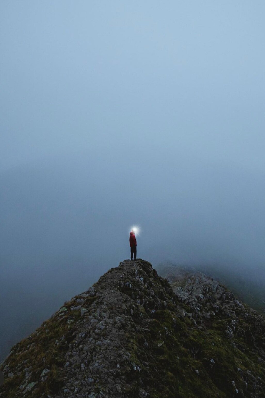
Photo by Frida Berg @friiidaberg (click for a link to their photography)
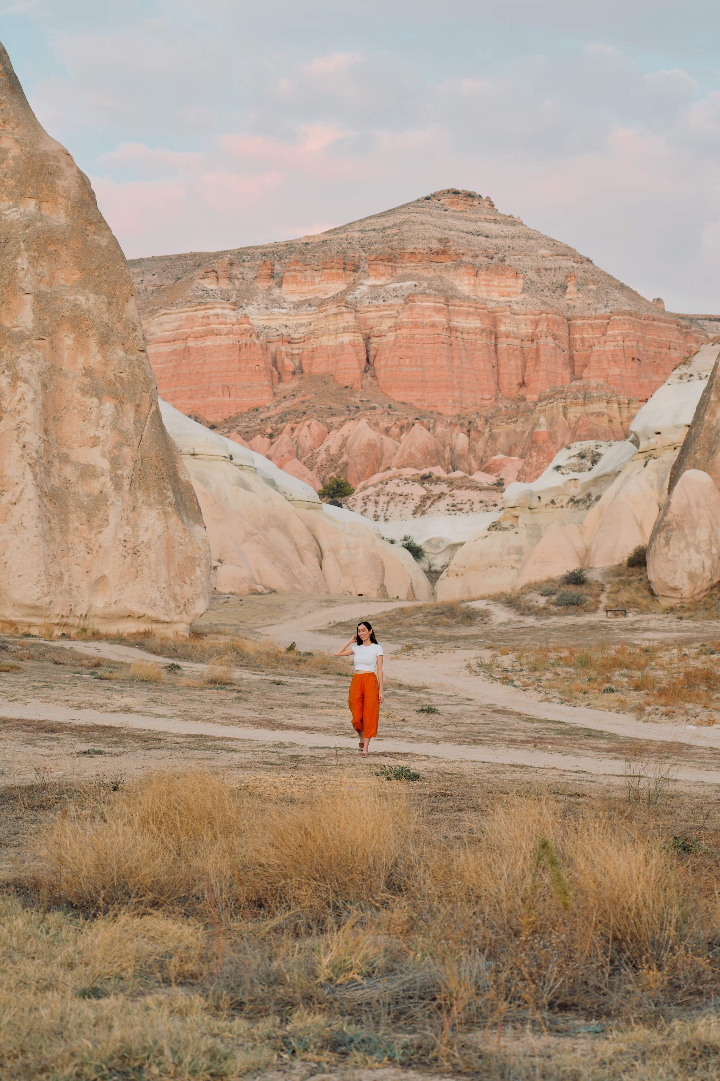
WARM TONES

Photo by Jon Sanchez @platoux (click for a link to their photography)
SATURATED + CONTRASTING
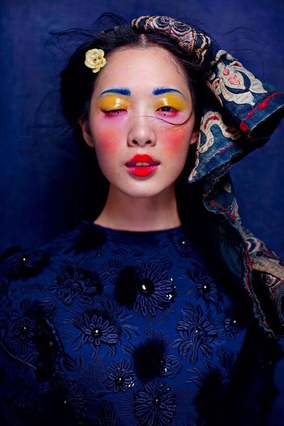
Photo by 陳漫 @chenman (click for a link to their photography)
PASTEL + COMPLEMENTARY
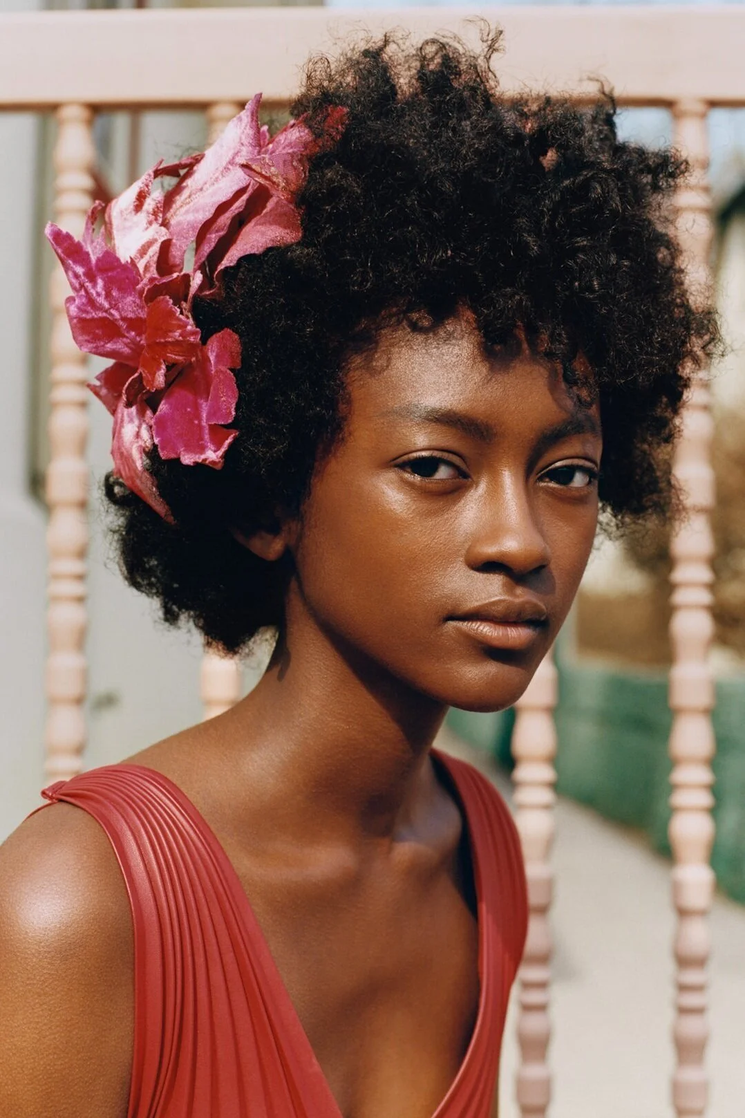
Photo by Tyler Mitchell @tylersphotos (click for a link to their photography)
In our own photo editing style, we tend to go for slightly warmer tones a base. It depends on the place that we’re shooting and the lighting conditions on the day, but we do take a lot of our photos at sunrise and sunset, so the colours in our original images are usually quite warm to begin with.
Then, we like to select and edit individual colours. This kind of colour grading can be done in Photos (on Mac), Photoshop (on desktop), Lightroom (on desktop or mobile), and free apps like ColorStory. In these, colours can be edited on a scale, with changes made the brightness and hue of each individual one.
If there is a dominant colour in the image, we like to bring that out first by making it brighter and slightly more saturated. Our main tip for vibrant images would be to focus on this dominant colour, and make sure that all other colours in the photo are less saturated.
It definitely comes down to personal preference, but we like to make the blues slightly more teal, and the reds warmer and brighter. We find that over-saturated greens and yellows can make our photos look unrealistic, so we usually desaturate these colours and make the hue slightly more red (rather than blue). Overall, the brighter reds, and warmer yellows and greens make our photos more warm toned on average.

Making the dominant blue stand out and adjusting it so that it’s more teal
Making the dominant red stand out by making it warmer and brighter
5. Think about the clarity
When we think about the clarity of an image, the two most distinct examples at either end of the spectrum would be:
1. photos that feel crisp; and
2. photos that feel hazy.
There are a lot of things that can change the clarity of an image on the day—especially the weather conditions (whether it’s cloudy, foggy or misty), how the focus has been used, and the focal range of the camera itself. In the photo editing process, the amount of detail in the image can also be changed through adjustments to things like the brightness, clarity, sharpness, definition, curve and black point.
CRISP PHOTOS
Settings to adjust
Crisp images usually have a strong focal point, and might have been precisely and manually focused when shooting. They could also be slightly more contrasted and sharpened in certain sections when editing.
Photo by Lee Litumbe @spiritedpursuit (click for a link to their photography)

Photo by Andrew and Emily @alongdustyroads (click for a link to their photography)
HAZY PHOTOS
Settings to adjust
Hazy images could look more like film—with a grainy, nostalgic and dreamlike feel. They could have more noise, but don’t appear to have very crisp detail in any one part of the image. They might not be sharpened, or could have the clarity or sharpness reduced. The shadows or black point of the image could be lightened, so that the darkest point of the image isn’t very dark at all.

Photo by Marianne @mroussety (click the image for a link to their photography)
Photo by Jay @wijayya_ (click the image for a link to their photography)
For our own editing style, we usually like our photos to appear well-focused but not too sharp. If the photo is a close up or focused on particular textures, we like to keep everything very crisp, sometimes increasing the sharpness just on certain sections of the photo. This is particularly the case for night photography and landscape photography, when we want as much detail in the image as possible.
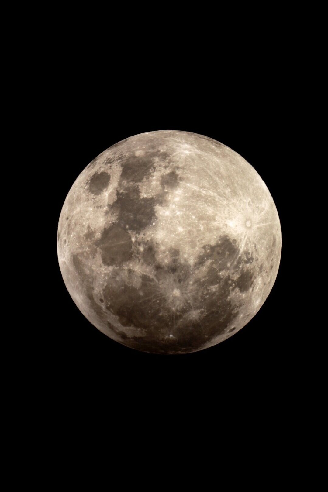
Increasing the sharpness to show more details in the moon

Increasing the definition to keep all textures in the landscape
But other times, we want everything to feel very soft and nostalgic To make our photos more dreamlike, we generally avoid making any changes at all to the sharpness or clarity so that none of the lines or edges seem too harsh.
For some photos we actually reduce the clarity—especially in darker photos where we want hazy lights or fainter clouds. Depending on what we’re editing with, there are a few ways that we make our photos hazier. In Lightroom, you can manually adjust the level of haze. In Photos (on Mac), the luminance slider can be used to give a really even, softened effect across the whole image, taking out detail in some areas.
Dreamlike editing style with very soft light
Editing a hazy image with more more noise and blurred edges
6. Decide which aspects to enhance or change
When you’re looking at your own images to start editing, think about each of the aspects above in the original shots:
what is the natural lighting like?
what are the natural colours like?
how is the clarity and detail in the image?
When we go through these things for our own photo editing process, we’re usually thinking about what we like about the original photo (what we’d enhance), and what we don’t like about the photo (how we can change it). Maybe we’ve taken the shot very late in the day, and it really needs brightening up. Maybe it’s a moodier scene than normal, and it would work well if it was slightly more contrasted.
7. Edit the same photo many ways
If you’re having trouble finding a photo editing style, we’d recommend editing one photo over again, in many different ways. A few years ago, we spent an entire day messing around with one image like this. Eventually, we had around 15 versions saved—each one with slightly different adjustments to the lighting and colours. We had darker versions, brighter versions, cool and warm toned versions, hazy and contrasted versions.
Then, we did something completely different with the colours and highlights, and remember really loving the way that particular editing style turned out. We started testing out similar settings on the next few photos that we took while in Japan, and loved the set of our travel photos that was starting to come together consistently with those adjustments.
Our editing has changed a bit since then, and we probably wouldn’t edit those photos in exactly the same way. But when we step back, it’s clear that we have actually just built on that particular style and a lot of things have stayed pretty consistent in our current editing.
8. Pick several different photos to edit consistently
To develop a consistent editing style, it always helps to edit photos in batches, so we’d recommend picking a few photos from one place at a time. Use the first photo that you’ve edited as a reference for the next one—even having them open side by side as you edit—and compare the lighting and colours on each new photo as you go.
It’s easy to create consistency across your photos with just a few key adjustments. When we have a range of photos taken in the same place, we always try to make sure that the dominant colour (like blues in the sky) are cohesive across each of the photos.

Editing several images from the same place/time of day helps to keep things consitent

9. Watch tutorials for similar styles
Once you’ve found an app or editing program that you like, there are endless tutorials available online for more in-depth information about what they can be used for. For general tutorials using Lightroom or Photoshop, we’d recommend Youtube videos by Jessica Kobeissi and Julia Trotti. If you have a particular editing style in mind, many photographers also share their editing process.
10. Shoot in RAW
We really believe that you can start photography with any kind of camera gear—including a phone camera—and the same goes for editing. We developed our editing style while taking pictures and editing them just on our phones, and then while using a DSLR in auto mode without knowing how to focus properly.
But eventually we switched to shooting in manual mode, which gave us much greater flexibility in developing our style as we could make immediate adjustments to the lighting while taking each image. Alongside this, switching to shooting in RAW massively improved our editing. This is because when photos are taken in JPG format, they are are compressed and a lot of the image data that the editing programs work with is discarded to reduce the file size.
On the other hand, RAW files essentially come straight from the sensors of the camera, and are saved as unedited and uncompressed files on the memory card. RAW images take up a lot more space, but they allow for so much more detail to be recovered from the image (especially in things like bright skies and dark shadows, which are often completely lost in JPGs), and they allow for a lot more control in the editing process.

Overexposed sections that would be blown our in JPG files

Details recovered from the RAW file
11. Form a unique editing style through practice
Unfortunately, it isn’t really possible to just “find” a photo editing style, and it’s more likely something that will be formed slowly over time, with a lot of practice. But we do think through most of the aspects above, and eventually found clear steps that sped up our process.
We think the main thing is to keep a balance between looking at photography and editing styles that inspire you, figuring out why they do, and trying a range of different adjustments until you find a style that suits your photography.
RECENT POSTS


PINTEREST:
Find us on Instagram

As there are long driving distances to the Sossusvlei salt pan, it was important to find convenient accommodation near the entrance. This post has 5 of the best desert stays in Sesriem, Namibia.